How the official 007-logo evolved (what's your favourite?)

edited December 2012 in Bond Movies Posts: 11,119
Used during the early Connery era:
header.jpg

Used during the last Bond film of Connery:
gif-daf-007-logo.jpg
02_joseph-caroff-007-logo-design.gif

Used since AVTAK until the early promotional stages of 'GoldenEye':
007.jpg
007_Logo.gif

Used during the first three Brosnan Bond's and QOS:
GE+007+logo.jpg

Used since DAD until SF.....QOS excluded:
logo.png
007-Logo.jpg

And here the most recent tiny changes between the modern 007-logo that we know since 'GoldenEye'. Especially look at the length of the gunbarrel:
verandering+in+laatste+7.jpg
007+credits.jpg

And here some other interpretations of the 007-logo that was different from Bond film to Bond film and was usually shown on the posters and main title designs:
60s.jpg
70s.jpg
80s.jpg
«1

Comments

  • As a graphic designer I love posts like these. Great job collecting all the different logos. I personally like the latest version, very sleek, they've taken the sight off the gunbarell etc, but I marginally prefer the 1995 'flat' seven to the curved one used from DAD onward... I don't know, I find that convex curve a little awkward and think it should curve in instead, but just a tiny bit.

    Something quite charming about the hand-drawn versions of before but I can't help love the evolved and refined version from Casino Royale onwards, especially as they got rid of that little drop shadow...
  • The 007 logo during Sean Connery's era & the 007 logo from Pierce Bronsan's era are my favourites.
  • Used during the early Connery era:
    header.jpg

    Used during the last Bond film of Connery:
    gif-daf-007-logo.jpg
    02_joseph-caroff-007-logo-design.gif

    Used since AVTAK until the early promotional stages of 'GoldenEye':
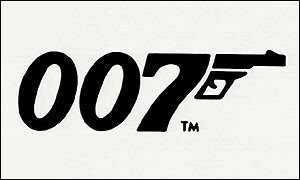
    007_Logo.gif

    Used during the first three Brosnan Bond's and QOS:
    GE+007+logo.jpg

    Used since DAD until SF.....QOS excluded:
    logo.png

    And here the most recent tiny changes between the modern 007-logo that we know since 'GoldenEye'. Especially look at the length of the gunbarrel:
    verandering+in+laatste+7.jpg
    007+credits.jpg

    Loving these 007 logos! :)
  • Great history of the evolution 007 Logo.

    I would like to see some of the graphically talented people make their own version of the logo... just out of curiosity.
  • Great history of the evolution 007 Logo.

    I would like to see some of the graphically talented people make their own version of the logo... just out of curiosity.

    That could be fun!
  • Creasy47Creasy47 In Cuba with Natalya.Moderator
    Posts: 40,978
    The former logo for Pierce's era is my favorite.
  • I'd say the Brosnan one, I like the slight 3d effect.
  • Samuel001Samuel001 Moderator
    Posts: 13,355
    Well put together. It's good to see the essence of the design hasn't really changed over the years.
  • LicencedToKilt69007LicencedToKilt69007 Belgium, Wallonia
    Posts: 523
    My favourite certainly is the Brosnan's one.
  • Posts: 562
    My favourite is easily the early Connery film version. It just feels like Fleming's Bond for some reason.
  • edited January 2013 Posts: 11,119
    I just found out something shocking yesterday! I always thought the little 'gun' attached to the '7' was a whole gun, with just a weird trigger embedded in the magazine/handheld.

    But now I am reading the chapter about 'Dr. No' in the Taschen 007 Archives. And apparently the guy who designed the 007-logo only added a barrel to the '7'. Actually, the foot of the '7' TOGETHER with the 'added barrel/trigger' has to be seen as one gun! I thought that barrel+trigger was always one entire gun!

    I never knew that! This completely changes the way I am looking at the 007-logo :-O!

    Damn, I love the Taschen 007 Archives :-D.
  • Posts: 5,745
    Uh.. I've always interpreted it as a whole gun. Why assume otherwise? :-??
  • Posts: 11,119
    JWESTBROOK wrote:
    Uh.. I've always interpreted it as a whole gun. Why assume otherwise? :-??

    You mean the '7' and the 'barrel' = the whole gun? Or only the little 'barrel with trigger' = solely a whole gun?
  • Posts: 122
    someone really took time to do this Why? get a hobby
  • CommanderRossCommanderRoss The bottom of a pitch lake in Eastern Trinidad, place called La Brea
    Posts: 8,266
    oorogers wrote:
    someone really took time to do this Why? get a hobby
    Becouse graphic design is a hobby, and as you can see above, his effort is appreciated by many here, including me.

    Now, I think I like OHMSS's logo best, then Skyfall's. Why I don't really know, they seem the most natural! Indeed, it would be great to see interpretations from members here who've got a graphic background!

  • St_GeorgeSt_George Shuttling Drax's lovelies to the space doughnut - happy 40th, MR!
    Posts: 1,699
    For the much part, they're all a variation on a theme - and it's a brilliant theme. A simple, brilliant, utterly iconic logo that's been around for 50 years approx.

    Mind you, from a mere sleek, stylishly successful design perspective, the efforts that incorporated the logo vertically into CR and QOS's titles stand out for me. They're excellent. Always loved the similar, earlier incorporation of the logo into Sir Rog's above-the-title name on the LALD posters too...
  • Posts: 122
    007 logo changes very little over the years so amazing effort made noticing the changes how ever little they are im shore any where you go in the world the 007 logo would be recognized either way so for recognizing the tiny differences well done i applaud you
  • Posts: 122
    in fact the 007 logo designers are as over payed and as skilled as the ones at Porsche
    i like the 007 logo but to set up a discussion on the minute changes boring sad etc
  • Posts: 183
    Great thread! Favourite is essentially the latest logo for Skyfall, and comes to show change can also be a good thing!

    Watch the double posts @oorogers, though looking back, you have 3 very contradictory posts, are you sure you arent two separate users? One minute you say this thread is sad and the second your applauding it...then you go back on yourself again! I certainly know what side of you I disagree with!
  • jcaroffjcaroff Berkeley ca
    Posts: 1
    Hi All,
    My grandfather was the original 007 designer. If you have questions about it as me. He’s 96 and still going strong so
    I can ask him your q’s.
  • RichardTheBruceRichardTheBruce I'm motivated by my Duty.
    Posts: 13,818
    What's his name and what other work has he done?
  • edited December 2017 Posts: 17,759
    jcaroff wrote: »
    Hi All,
    My grandfather was the original 007 designer. If you have questions about it as me. He’s 96 and still going strong so
    I can ask him your q’s.

    Hi, and welcome! I'm interested to hear if there was other, unused «007»-designs that were made? And how did the process of creating the logo go – from start to finish?

    (I'm a graphic designer myself, so any information would be a great read!)
  • ggl007ggl007 www.archivo007.com Spain, España
    Posts: 2,541
    @jcaroff Great to have you here. I guess your father did this:

    007-logo-original.jpg

    Great work. I think in FRWL the logo changed with two bullets under the gun. Was he thinking in adding more bullets each film?

    009-from-russia-with-love-theredlist.jpg?w=300&h=247
  • Posts: 1,031
    I just found out something shocking yesterday! I always thought the little 'gun' attached to the '7' was a whole gun, with just a weird trigger embedded in the magazine/handheld.

    But now I am reading the chapter about 'Dr. No' in the Taschen 007 Archives. And apparently the guy who designed the 007-logo only added a barrel to the '7'. Actually, the foot of the '7' TOGETHER with the 'added barrel/trigger' has to be seen as one gun! I thought that barrel+trigger was always one entire gun!

    I never knew that! This completely changes the way I am looking at the 007-logo :-O!

    Damn, I love the Taschen 007 Archives :-D.

    Yes the top left of the '7' is also like a folding stock.
  • Posts: 1
    oorogers wrote: »
    someone really took time to do this Why? get a hobby

    Because it is important as what was the origin of the Mona Lisa smile. 007 is a cultural phenomenon like Michael Jackson, like Andy Warhol, like Armani, like Tom Ford like Ferrari. It is a brand. You name it.
    Sincerely,
    [email protected]
  • MurdockMurdock The minus world
    Posts: 16,351
    Welcome to the forum @Aramis, though the response you replied to is 7 years old at this point and oorogers hasn't been active on this site in 6.
  • Posts: 1,860
    Circa Goldfinger logo for me.
  • QBranchQBranch Always have an escape plan. Mine is watching James Bond films.
    Posts: 14,590
    I prefer the shape of the Dalton era logo. Karl Stromberg would disapprove of the acute inner corner of the 7 on the most recent logo - it is least ergonomic, pinching the finger-to-thumb web.
  • matt_umatt_u better known as Mr. Roark
    Posts: 4,343
    I'm loving the vintage references of this one.


  • Jordo007Jordo007 Merseyside
    Posts: 2,641
    The new one looks very classic and full on 60's, it's cool
    The 50th one was my favourite because it just screamed Bond
Sign In or Register to comment.