Reporting For Duty
It looks like you're new here. If you want to get involved, click one of these buttons!
Quick Links
Categories
Thunderball's 007 fanart thread
 Thunderball
playing Chemin de Fer in a casino, downing Vespers
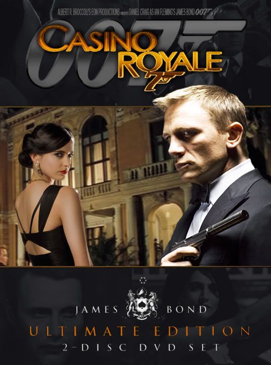
I just created an Ultimate Edition cover for Casino Royale. Check it out...
[img][/img]
Perhaps soon I'll make a Quantum of Solace one, too, but I'm pooped right now.
[img][/img]

Perhaps soon I'll make a Quantum of Solace one, too, but I'm pooped right now.
^ Back to Top
The MI6 Community is unofficial and in no way associated or linked with EON Productions, MGM, Sony Pictures, Activision or Ian Fleming Publications. Any views expressed on this website are of the individual members and do not necessarily reflect those of the Community owners. Any video or images displayed in topics on MI6 Community are embedded by users from third party sites and as such MI6 Community and its owners take no responsibility for this material.
James Bond News • James Bond Articles • James Bond Magazine
Comments
Just like the movie itself, this didn't turn out quite as good as Casino Royale. I had a hard time finding good images of Craig with a gun in hand. This pic of him was black and white and I had to color it. Looks terrible. Anyway...
I plan on doing an UE cover for Skyfall, too and I hope more color photos of Daniel Craig are released, holding a gun.
Good work @Thunderball. Welcome to MI6! :)
I'll be looking forward to that! Your last two were really great, nice job on those, especially Quantum of Solace's, I actually liked it better than the one for Casino Royale!
Fixed. Thanks for pointing that out.
About Skyfall. Though of course it won't be out for another 2 months, I decided what the hell:
More explosive goodness....
How about making some bluray covers?
Strikes me as kinda funny making Ultimate Ed. DVD covers for Daniel Craig's Bond films since EON/MGM has replaced those with the 50th Anniversary Blu-ray....
Well, here is a coupla things I did just for the hell of it. Are they DVD/Blu-Ray covers? I dunno. Kinda like the feel though...I will make more soon.
For your latest two works, perhaps keep the titles closer to a similar size, or even closer together? I love the format, color, and everything of them, I just think 'Thunderball' would look a lot better if it was closer together, all lowercase (excluding the first letter), and the same size.
If that's your vision, please don't let me change it in the slightest; trust me, I am far from artistic, so don't ever change your style for someone, especially me. Keep them coming, I'm loving what you're doing so far.
Here's a couple more:
More to come..
On the movie front, I particularly liked 'Skyfall' but I found your work on Fleming's novels particularly impressive. You really managed to incorporate the stories into your visuals whilst keeping a consistent code. My absolute favourites were Casino Royale & TSWLM.
Albeit with TSWLM, I think the clothing doesn't really go with the vespa. In my opinion she should be in mod attire as the scooter, which is absolutely a keeper, has to reference the London leg of the story, as they hardly exist in the USA.
All in all, this work is great and IFP/JC would do well to look at it.
Very reminiscent of the great work done by the late, great Raymond Hawkey's work for PAN books in the '60s.
Why don't you post the book covers on a literary thread?
Hugely enjoyable!
I particularly like Casino Royal, TSWLM and FRWL.
Simple and precise posters. BTW, Craig's QOS pose with the gun is one of his best, unless the best.
Only a few more to go... and coming soon, Bond Girl wallpapers.
...reading Fleming. ;)